Harnessing Safety Leading and Lagging Indicators to Transform Workplace Safety
March 20, 2024
14 minute read

The world of workplace safety has made huge progress in the last 50 years. But serious risks remain and relying solely on past incident data won’t cut it anymore.
In 2022, 5,486 workers in the U.S. died on the job. That number is unacceptable.
For EHS leaders committed to eliminating serious injuries and fatalities (SIFs), relying solely on incident investigations and root-cause analysis isn’t enough. Today’s best safety programs use a combination of leading and lagging indicators to prevent harm—not just respond to it.
In this post, we’ll break down the role of leading indicators for safety and how to get started with metrics that drive measurable improvement.
What are leading and lagging indicators?
Lagging indicators track events that have already occurred, like injuries, severity rate, workers’ compensation, and equipment damage costs. It combines extensive data analysis and subsequent corrective actions, has significantly reduced fatal and nonfatal injuries.
Leading indicators, on the other hand, are proactive. They measure actions, conditions, or behaviors that help predict and prevent future incidents. When implemented correctly, leading indicators give you insight into how safety processes are actually working in the field—long before an incident occurs.
When combined, these indicators offer a complete picture of your safety performance.
Why relying on lagging indicators alone falls short
Many safety programs focus on lagging indicators because they’re standardized and required by regulators. But this reactive approach has serious limitations:
- It relies on incidents that have already occurred. It offers no protection to those who were harmed, and does little to build trust in the organization’s safety culture.
- There is less data to support analytics as workplace safety programs improve and fewer incidents occur. Insufficient data might give a false impression of safety performance and generate less accurate preventative models.
Four safety truths you need to know
Over the past four years, Predictive Solutions gathered data from more than 200 companies including over 3.4 million inspections and and 92 million safety observations. Here are four truths about safety leading indicators:
Safety Truth #1: As inspections increase, incidents go down.
Inspections are one of the easiest things to track, and they’re important to encourage. But just doing more inspections isn’t enough to keep people safe.
It’s like looking at your grades every day and expecting them to improve. Seeing the scores is helpful, but without studying, nothing actually changes.
Safety Truth #2: More diverse observers = better results.
The more people you have doing inspections—and the more different roles they come from—the fewer incidents you’ll have.
It’s not just the safety team’s job. To truly improve safety, everyone needs to be involved. That includes leaders, supervisors, and workers. Everyone should help spot hazards, report them, and helping to mitigate the risk they pose—both short- and long-term.
Safety Truth #3: Too many 100% safe inspections can be a red flag.
Typically, a high number of inspections with no at-risk findings are seen on worksites with a relatively higher rate of injury.
This is a very interesting and potentially counter-intuitive metric. You’d think that finding fewer safety issues means things are getting better. But mistakes can still happen, especially when people are involved.
Even if one problem is fixed, another one can show up that wasn’t noticed before. Sometimes, workers don’t report unsafe conditions because they’re afraid of getting in trouble.
But finding at-risk situations should be seen as a good thing. It gives you a chance to fix something before someone gets hurt. Every unsafe finding is an opportunity to learn, improve, and make the workplace safer.
Safety Truth #4: Too many at-risk observations are predictive of higher injury rates.
This might seem like it goes against the last safety truth, but it’s actually a different way of looking at the data. Finding at-risk conditions isn’t the problem—it’s when the same problem shows up over and over again.
For example, let’s say an inspector sees someone standing on the top of a ladder, which is unsafe. They stop the work, talk to the worker, and find a safer way to do the job. Problem solved—for now.
But what if this same issue keeps happening at other sites, or multiple times in the same month? That’s a sign of a bigger problem.
Fixing one situation is good, but to make long-term improvements, you have to understand why it keeps happening and fix the root cause.
7 safety leading indicators to track
It’s not enough to just track leading indicators for safety. The real value comes from what you do with them. The goal shouldn’t be to hit a certain number. It’s to start conversations, uncover risks, and make real improvements.
Based on the studies that lead to the Four Safety Truths, the resultant metrics yielded a great ‘starter kit’ for safety leading indicators.
1. Inspections (count of inspections; traditionally over time)
Inspections are the building blocks of leading indicators. They help teams see the difference between how work is supposed to be done and what’s actually happening in the field. But they only work if people believe the inspections matter.
2. Observations (total count of unique observations)
Inspections are made up of one or more observations. An observation is when someone checks a specific behavior or condition—for example, whether a worker is wearing safety glasses or if an electrical cord is in good shape.
Each observation is marked as either safe or at-risk. It’s best to count each one separately. For example, if you’re checking ten workers for safety glasses, you should record each person individually.
This makes it easier to understand how many observations were made, how many were safe, and how many were not. Most observations are safe, but tracking both safe and unsafe ones gives a more accurate picture.
Tracking both safe and at-risk observations helps make sure inspections are done consistently and gives a clearer picture of what’s actually happening on site.
3. Safe observations (total count of safe observations)
Safe observations are just as important as finding problems—and they offer a lot of benefits during inspections.
- They help you give positive feedback, not just correct mistakes. This builds trust and encourages good habits instead of creating a “gotcha” culture.
- If you only track what’s wrong, you’re missing half the story. Just because there are no unsafe findings doesn’t mean things were done safely—it might mean no one was really looking.
- Safe observations prove that safe work happened. They show what was checked, where, and by whom.
- Tracking both safe and unsafe findings gives you a clear ratio. For example, if 80% of electrical safety checks are safe and 20% are at-risk, that tells a different story than if 80% were unsafe.
- The number of people observed matters. If three people aren’t wearing safety glasses out of a group of three, that’s a big issue. But if it’s three out of 300, it may be less serious. Context matters.
- Safe observations help you measure improvement. If you fix an issue, how do you know it worked? Seeing more safe behaviors over time shows your safety efforts are working.
4. Percent safe (total count of safe observations/total count of all observations)
On average, each inspection in the dataset includes 32 observations—and about 97% of them are safe. This number is called percent safe. It shows how many of the observations were safe compared to all the ones made.
This number can be helpful, but only if you understand how to use it.
- Don’t rely on it alone. One inspection with a high percent safe doesn’t mean everything is fine. It’s just a snapshot. It could mix different types of work—like PPE, housekeeping, and fall protection—so it’s easy to read too much into it.
- Look at trends over time. When many observations are collected on the same topic (like fall protection), percent safe can show whether things are improving or getting worse.
- Use it to track progress. If you’re trying to fix a safety issue, you should see more safe observations over time and fewer unsafe ones. That’s a good sign your plan is working.
Just remember: Percent safe is helpful, but only when the data is focused on the same topic and you use it to guide smart actions.
5. Frequency of all-safe inspections (expressed as a percent)
Inspections include both safe and at-risk observations. While most findings are safe, spotting at-risk ones is actually a good thing—it shows where there’s room to improve and helps prevent injuries.
It might seem like having lots of inspections with no at-risk findings is a sign of strong safety. But surprisingly, sites with many “all-safe” inspections often have more injuries. That’s because problems may be missed, ignored, or not reported.
If every inspection shows 100% safe results, it may be worth asking:
- Are inspectors trained to spot hazards?
- Do workers feel comfortable reporting unsafe conditions?
- Does the company respond supportively to at-risk reports?
In the data, 50% of inspections were marked as completely safe. While some inspections might genuinely find no issues, that should be the exception—not the rule. The key is to focus less on the number and more on why at-risk findings aren’t being reported.
6. At-risk observations (total count of at-risk observations)
The goal of safety observations is to spot work conditions or actions that could lead to injuries—so steps can be taken to fix them before anyone gets hurt.
Observers compare what’s supposed to happen (based on the safety plan) with what’s actually happening on site. Any gaps are marked as at-risk and give the team a chance to improve.
But here’s the challenge: It’s hard to fix risks if no one knows they’re there. And sometimes people don’t report unsafe situations because they don’t want to get in trouble or make others look bad.
On average, the data shows one at-risk finding per inspection. If we remove the fear of blame, people are more likely to speak up—and that leads to better safety for everyone.
Also, the more details an observer includes (like comments about what they saw), the more valuable the report becomes. In fact, 77% of at-risk findings in the data include helpful comments.
7. Severity (degree of risk associated with an at-risk observation)
Not all safety issues are equal. Some are small and low-risk, while others are much more dangerous. That’s why it’s important to rate the severity of each at-risk observation.
Observers can use a risk matrix to decide how serious something is:
- Low or Medium severity: Minor issues like PPE not worn properly, housekeeping problems, or missing labels.
- High or Life-Threatening severity: Serious risks like falls from heights, electrical hazards, confined spaces, or working with dangerous materials.
Most unsafe findings are low or medium risk—about five times more than high-risk issues. This shows that teams often focus on smaller problems, even though the most serious hazards are the ones that can lead to major injuries or deaths.
Turning safety metrics into action
To make leading indicators actionable, organizations need to:
- Make metrics S.M.A.R.T.: Specific, Measurable, Achievable, Realistic, Timely
- Set clear expectations: Define what “good” looks like
- Foster a culture of transparency: Encourage honest reporting
- Drive conversations—not compliance: Metrics should spark discussions, not fear
- Use the data to take action: Insights without action won’t reduce risk
The role of the frontline worker
Frontline workers experience the real consequences of unsafe conditions. In high-risk industries like transportation and material handling, the danger is clear—1,620 workers in these roles lost their lives in the U.S. in 2022 alone.
To build a strong safety culture, these workers must trust that leadership prioritizes their well-being. But trust is a two-way street. Workers also play a key role in spotting hazards and helping prevent incidents.
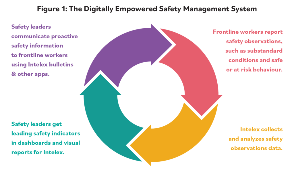
With mobile devices and AI-powered tools, workers can now report near misses or unsafe behaviors instantly—from anywhere. This real-time reporting closes the gap left by delayed or incomplete incident data.
This shift creates a continuous feedback loop. Workers share data, safety leaders act on it, and insights are shared back through tools like bulletins, microlearning, and safety briefings.
When workers are empowered to speak up and see results, they become active contributors to safety—not just participants. They help spot trends early and support real-time corrections that reduce risk for everyone.

Advanced safety technology
In many complex industries and environments, health and safety practitioners use a combination of frontline workers’ reports and cutting-edge technology to get a comprehensive picture of the risk factors in processes and operations.
Solutions like the Intelex + Protex AI partnership use tools like AI, computer vision, and CCTV to spot hazards in real time—from workers entering restricted zones to missing PPE or unsafe vehicle movement. This gives safety leaders instant visibility into high-risk situations and helps them act faster to prevent harm.
With this tech in place, organizations build stronger safety cultures by combining real-time insights with real-world actions.
See how companies are using AI to promote a data-driven safety culture.
Real results: How Coats improved safety with leading indicators
Coats is a world leader in thread manufacturing and structural components for apparel and footwear, and an innovative pioneer in performance materials. With 17,000 employees on six continents, the company implemented Intelex Incident Management Application to ensure proactive safety management in its locations.
With the help of Intelex and as part of its Journey to Zero strategy, Coats achieved seamless reporting and visibility of incidents. “We had a tremendous increase in the identification of improvement actions,” says Andrew Morgan, Group Health and Safety Director at Coats, “which in turn has resulted in a reduction in the number of injuries or other incidents.” The data since 2018 showcases Coats’ safety success.
| Safety Indicators | Trends |
|---|---|
| Near-Miss Reporting Rate | +33% |
| Hazard Reporting Rate | +36% |
| Improvement Actions Completed Rate | +55% |
| Corrective Actions Closed Within 30 Days | +89% (from 39%) |
| Work-Related Incident Rate | -35% |
| First-Aid Incident Rate | -10% |
The notable rise in submitting data about near misses and hazards has demonstrated heightened risk awareness among employees. This proactive safety-conscious reporting reinforces a continuous improvement mindset within the organization.
The safety journey ahead
At its core, safety management is about one thing: keeping people safe. But as industries evolve, so do the risks. Staying ahead means adapting your approach.
“For me, safety is personal,” says James Pomeroy, Group Director of Safety at Lloyd’s Register. “The big game changer is how [data and technology] can help people to be safer and how we can prevent the serious and major accidents and ill health that I’ve had exposure to in my career.”
Using a mix of leading and lagging indicators, supported by smart technology and engaged frontline teams, organizations can build proactive safety programs that truly make a difference.
When workers are empowered with the right tools, training, and support, they’re more likely to speak up, take action, and look out for one another. And that leads to workplaces where everyone goes home safe.
Ready to transform your workplace? Take a custom demo tour. Choose from four pre-built streams or create your own!
Note: Updated in March 2025 to include findings from Predictive Analytics research.


